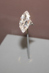
 Logos don’t have to be fancy. So I balked when I first saw a comparison of diamonds and logos. But the analogy works very well.
A great logo is like a diamond in that it catches your eye immediately. That’s why I’ve put together the 5 C’s of logo design.
- Clear
- Clean
- Concise
- Color
- Creative
If you follow these five criteria while designing a logo, you will have a simple symbol for your brand. The simpler the image, the more places you can use it.
You can shrink it into a favicon for your website or avatar for social media. It can be printed or copied in black and white when consumers want to distribute your content. It will fit on a business card or billboard.
You need one image you can use across all media to preserve branding consistency.
Is your logo polished enough to do that?
